Introduction
Overall Structure
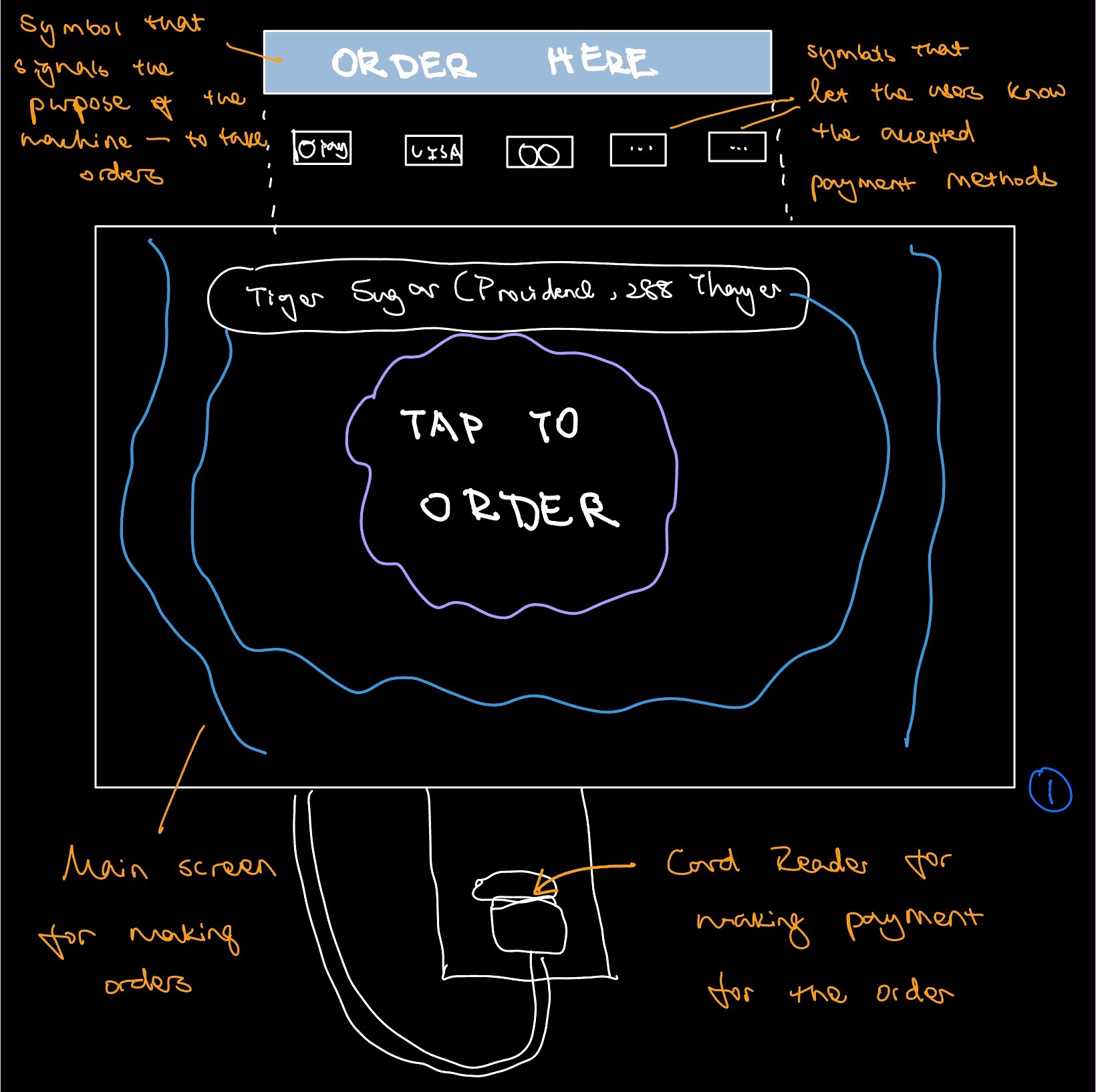
This interface is the Snackpass self-checkout machine used at Tiger Sugar, a popular boba shop on Thayer street. Its purpose is to facilitate the process of ordering boba for customers. It has three main components:
- The signs at the top that tell the users the purpose of the machine and the accepted payment methods
- The main screen for selecting and making the order in the middle
- The card reader for processing payments for the order at the bottom
User Observations
Key Observations from Users
- In general, the users spent around one minute interacting with the interface.
-
The users went through the steps on the interface in a similar order. They all followed this pattern:
- Tap on the screen to begin ordering
- Select product(s)
- Add customization to the product and add it to their cart
- Check out
- Add phone number
- Add optional tip
- Pay
- Get final confirmation with order number
- Go back to home page
- Some of the users took some time to scroll through the products on the home page while others jumped straight to selecting the product they wanted.
- The users went through most of the steps quickly, with occasional pauses.
-
All three users paused and seemed surprised (i.e., raised their eyebrows and squinted at the screen) when they were interacting with two features of the interface:
- when it asked for the user’s phone number
- when it defaulted the tip to two dollars
Interview Questions
- What does your typical weekday look like?
- What is your goal for using this interface?
- How often do you use this interface to order boba?
- What is your relationship like with boba?
- Does ordering boba impact other areas of your life/work? If so, how?
- How much time do you typically spend on ordering boba with this interface?
- Tell me about the last time you tried to order boba with this interface.
- Why did you choose to order boba on this interface over ordering in person?
- Is there anything you like about ordering boba on this interface?
- Is there anything particularly challenging about ordering boba on the interface?
- Is there anything surprising or unexpected about this interface?
- Is there anything you would change/add/remove to make this interface better for you?
- What feature of the interface is most important to you?
- What feature of the interface is least important to you?
- What is your opinion about the organization of information on the screen?
- Would you keep using this interface in the future?
- Is there any other boba ordering interfaces you've tried out?
- How does this interface compare to other boba ordering interfaces?
- Is there anything in particular that you like/dislike about the other boba ordering interfaces?
- What adjectives would you use to describe this interface?
- Does this interface feel like it was designed for you?
- On a scale of 1-5, how likely are you to recommend this interface to a friend?
User Response
- The users share a common goal for using the interface: order boba quickly without having to talk to someone.
- The users like how easy and efficient it is to use the interface to accomplish their goal. They all mentioned how they can just walk in, make a few clicks on the interface, and get boba.
- The users like the clear organization of information on the interface. They like how they can scroll through all the products, view products by category and search for a specific product through the search bar. The users prefer to use the interface over in person ordering because they have access to all the information at their fingertip instead of having to squint at the small text on the physical menu.
- The users were confused or surprised by some features of the interface. They did not understand the purpose of the phone number input feature. They were confused by the claim rewards feature because they didn’t know what the rewards entail. They did not like when the interface defaulted the tip to two dollars and considered a trick for them to spend more money without paying attention.
- The users found some features of the interface hard to find, such as entering the promo code and undoing order in the cart. They said that the color and position of the text on the screen made these features hard to notice without paying closer attention.
Empathy Maps
An Empathy Map is a collaborative visualization used to articulate what we know about a particular type of user. Typically empathy maps are split into 4 quadrants (Says, Thinks, Does and Feels). They help designers gain a deeper understanding of their target audience and the reason behind their actions.
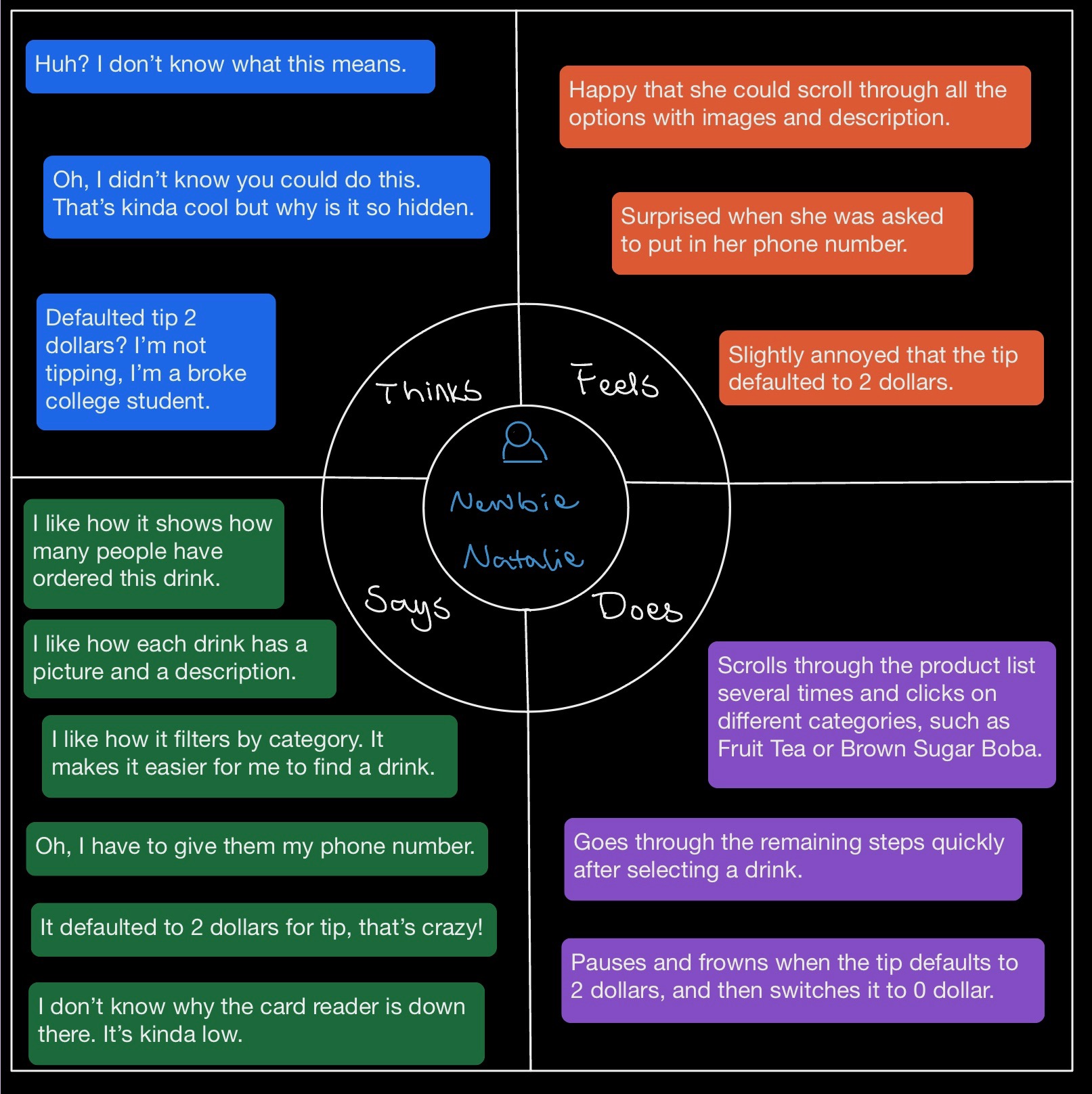
Empathy Map for Newbie Natalie
Newbie Natalie is a Brown student who loves drinking boba with friends. It's her first time ordering at Tiger Sugar. She chose to use the self checkout interface over in person ordering because she wants to explore different options and order quickly. However, she's surprised and confused by some features of the interface, such as when it asked for her phone number and when it defaulted the tip to 2 dollars. Natalie is representative of users who are new to Tiger Sugar and its self checkout interface. She is also representative because most of Tiger Sugar's customers are Brown students who love drinking boba.
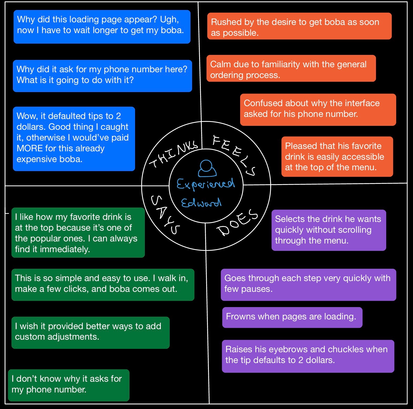
Empathy Map for Experienced Edward
Experienced Edward is a Brown stduent who LOVEs drinking boba, and Tiger Sugar is his go-to boba place. He always chooses to use the self checkout interface because it's very efficient and he doesn't have to interact with anyone. However, as a boba fanatic with high standards for his boba, he thinks that the interface doesn't provide an easy way to add custom adjustments. He also doesn't understand the purpose of some features but are used to them. Edward is representative of Tiger Sugar's returning customers. These users are very familiar with the products and the interface itself. They love a simple and efficient boba ordering interface, but they also look for features beyond the basics, such as being able to customize their order.
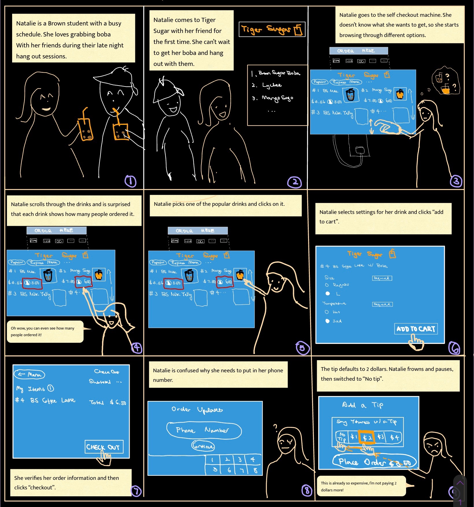
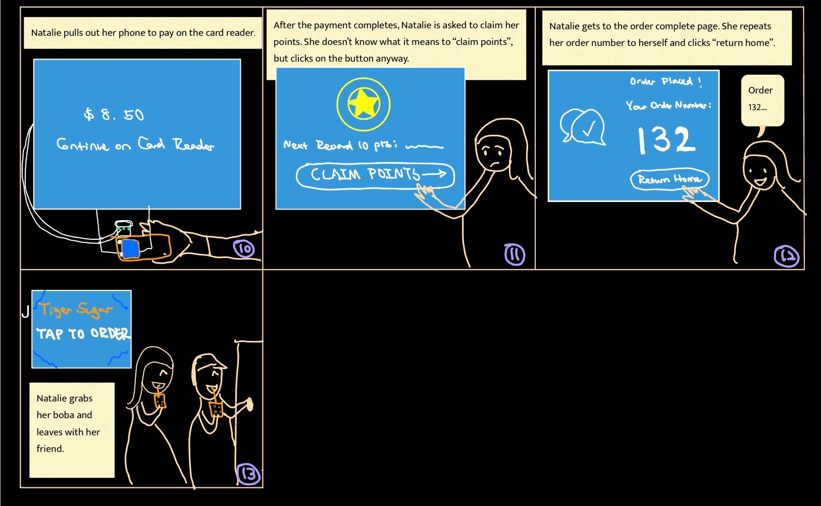
Storyboards
A Storyboard is an illustration that represent shots that ultimately represent a story. In UX, it is a tool that helps designers visually predict and explore a user's experience with a product. It is an effective way to capture, relate and explore experiences in the design process.
Conclusion
Personas and Storyboards are two effective tools for designers to understand how users interact with a particular interface. Throughout the process of creating Newbie Natalie and Experienced Edward, I was able to understand and empathize more with the users of the self-checkout machine at Tiger Sugar.
I also learned important skills for conducting User research, including coming up with stimulating questions, observing users, and creating personas and storyboard.