Introduction
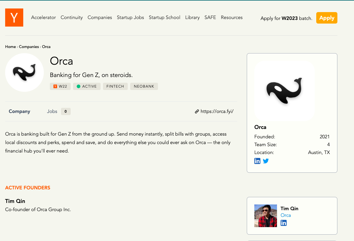
Orca
For this project, we were tasked with taking an existing startup and creating a design that serves their goal. We chose Orca, a startup founded in 2021 based out of UT Austin. Orca describes themselves as “Banking for Gen Z, on steroids.” Their app concept boasts of features including the ability to spend money instantly, splitting bills with groups, access to local perks and discounts, and surfacing personal finance data. Orca is striving to be the only financial hub a user needs: everthing, all in one place.
Our version
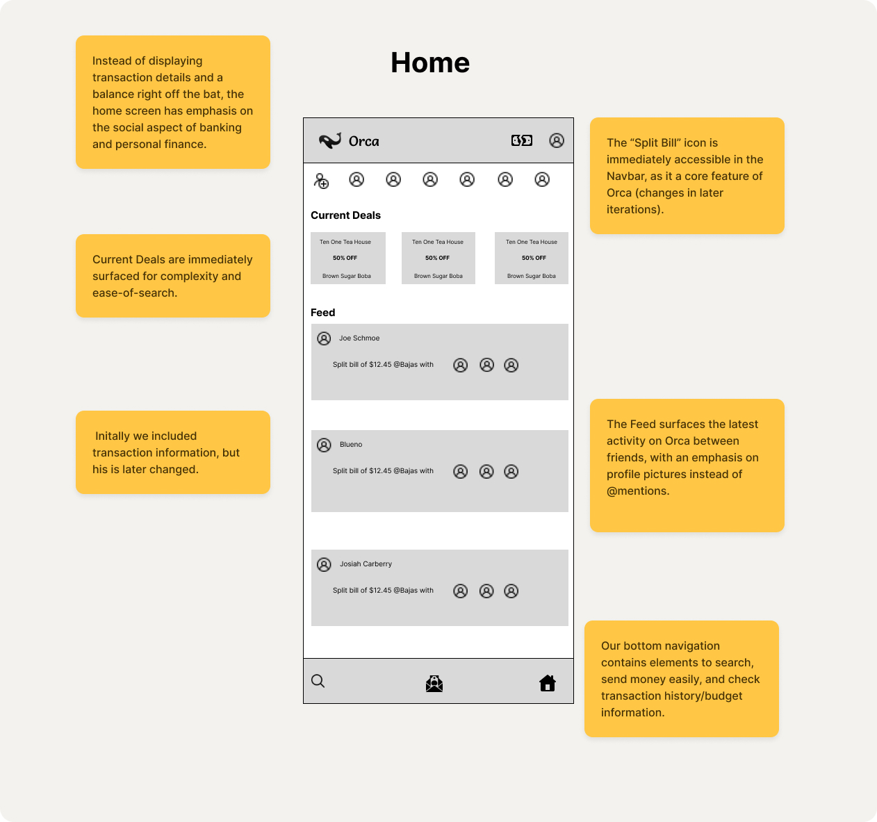
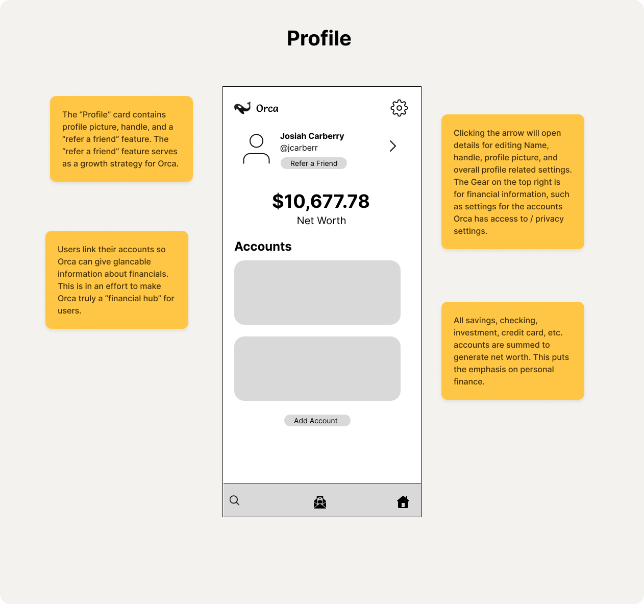
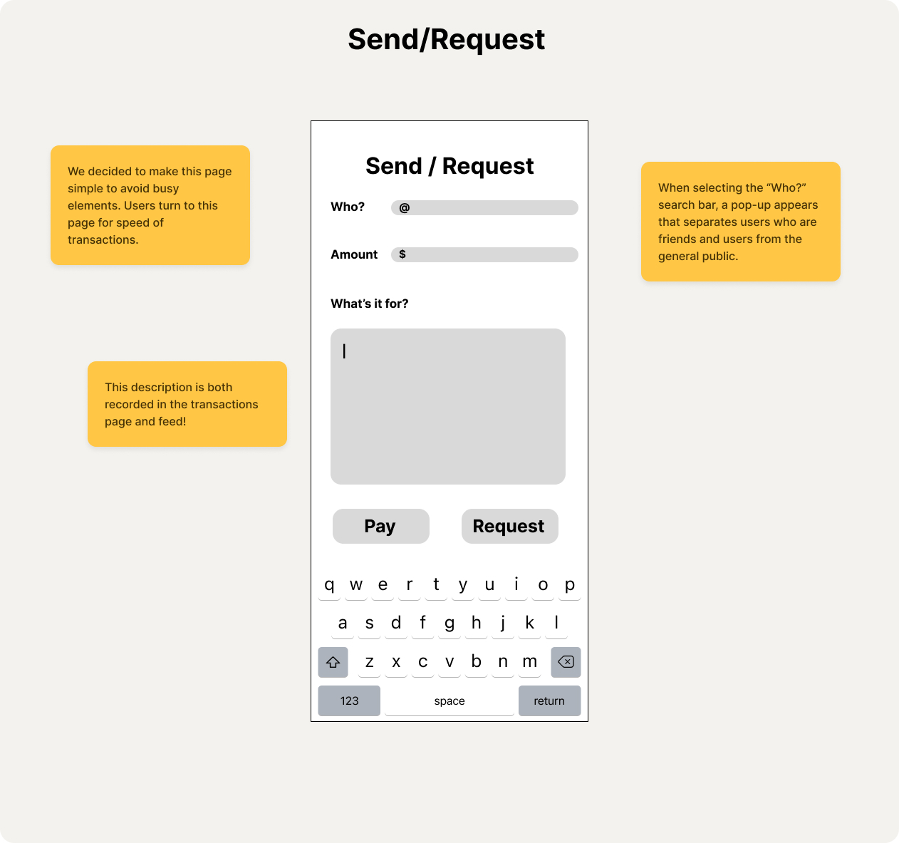
Because of Gen Z's desire for instantaneous information, and their tendency to have their phones with them at all times, we decided to design a mobile app for Orca. We focused on the aforementioned features with an emphasis on splitting the bill, access to local discounts, and easy access to financial data: as these are Orca's differentiators from their competition.
As Orca is designed for Gen Z, our design needed to meet the needs of this demographic. We included elements similar to Venmo and Snackpass, two apps popular among Gen Z, to give a sense of familiarity for the users. Despite being for Gen Z, the app is intutive for all ages.
Sketches
In this phase, our group split up and created our own sketches. We wanted to let the creativity flow, and have as broad as a discussion as possible. So we took the concept of Orca, drew sketches of what we personally thought would meet the goals of Orca, and covened afterwards for discussion.
Here are our various sketches! Click on any sketch to enlarge it and view it in more detail!
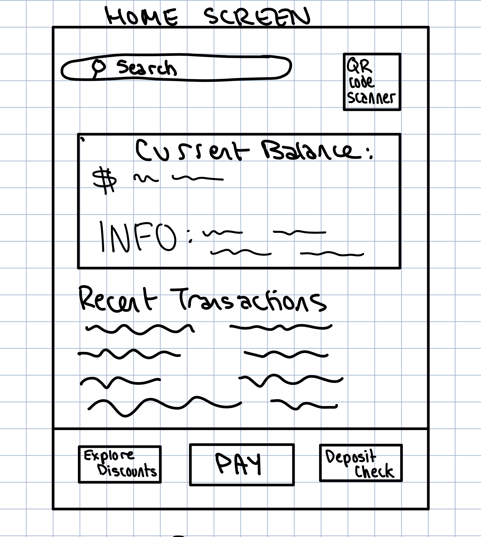
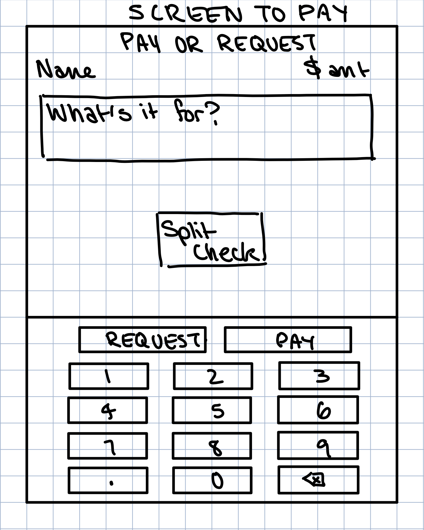
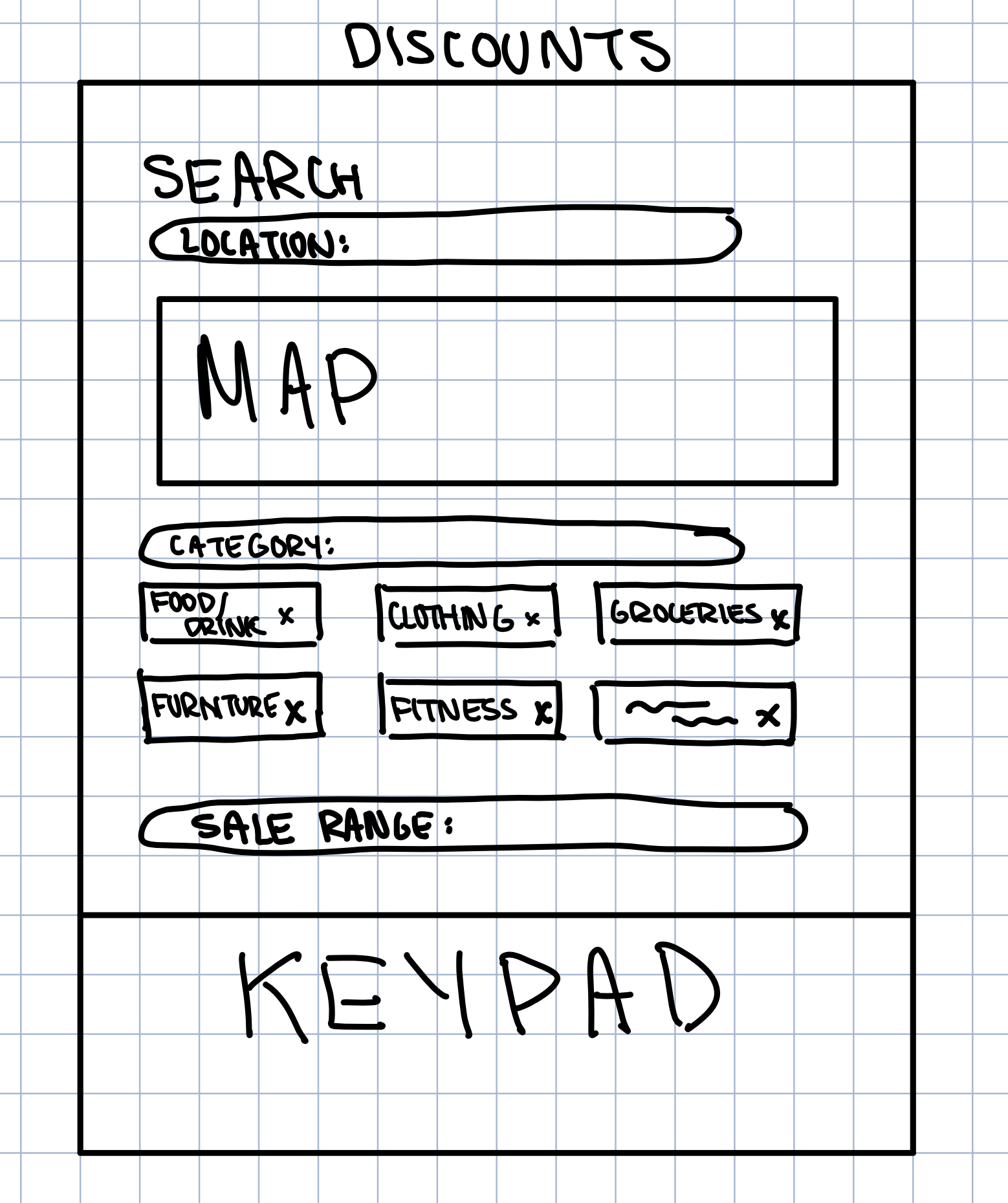
Following our discussion, we identified which features would be the most crucial for our app.
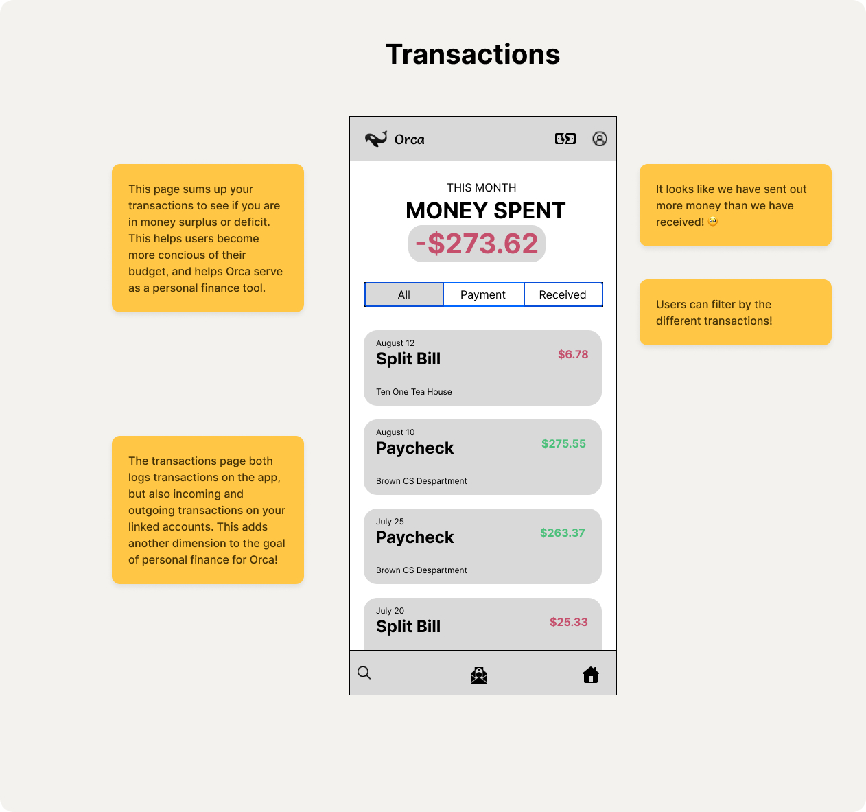
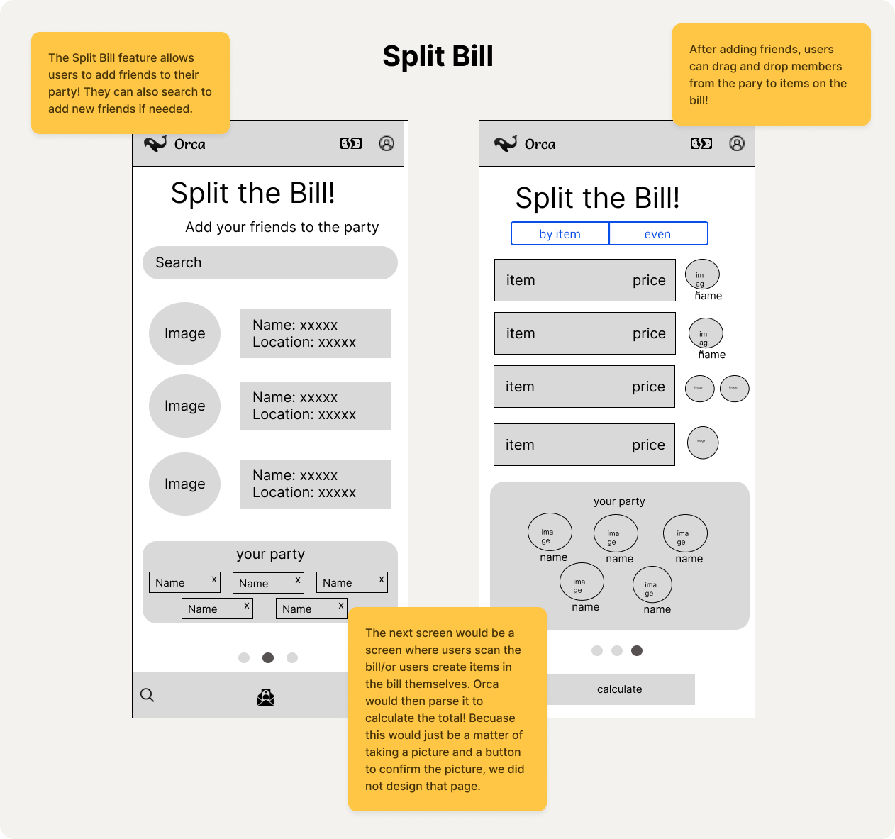
We determined that splitting bills, keeping track of transactions, financial account integration, and the overall social aspect are key. Check out the next section to see how this culminates in our final wireframes.
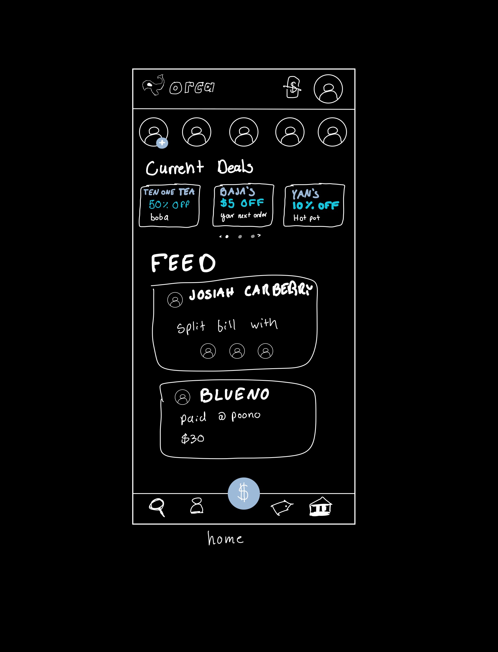
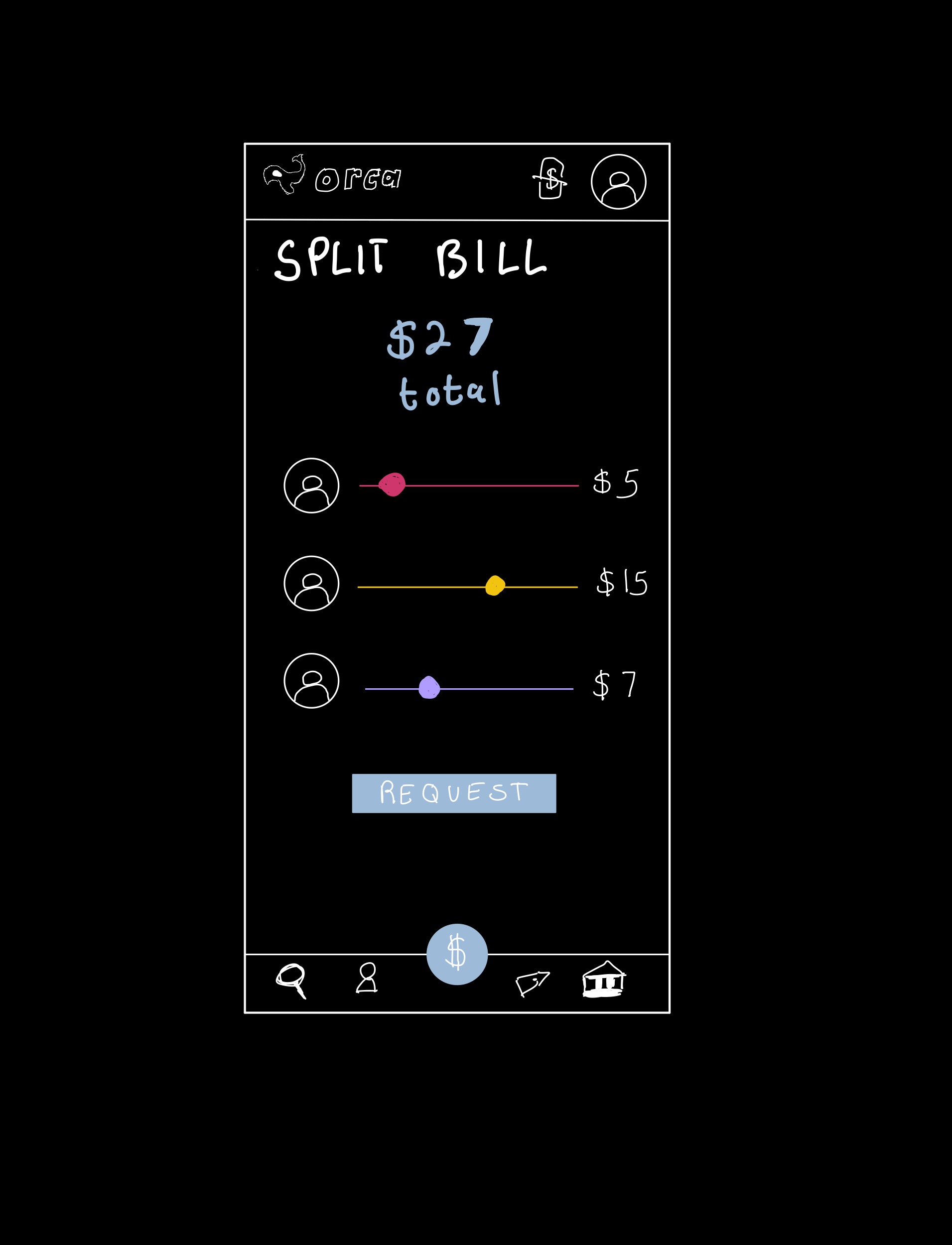
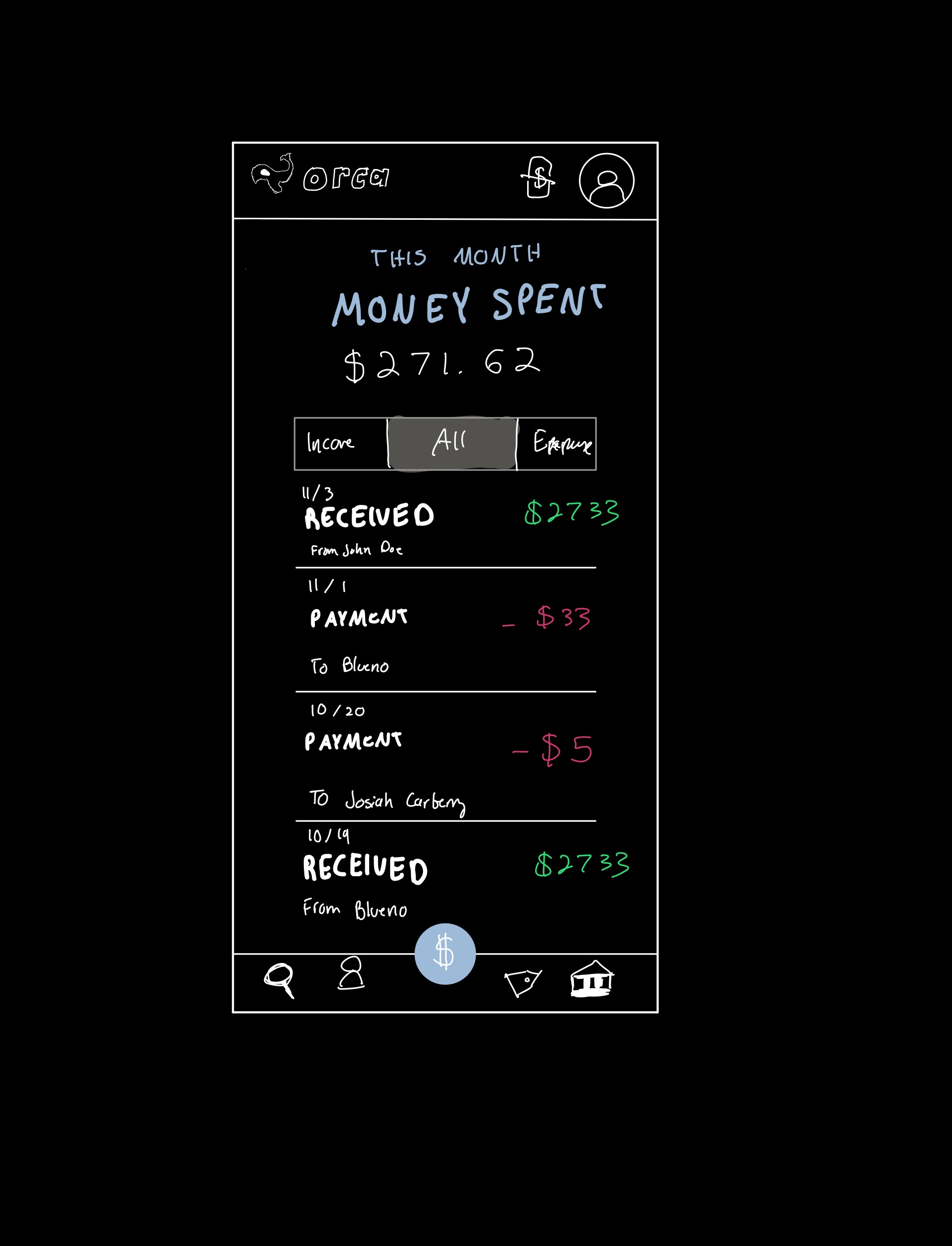
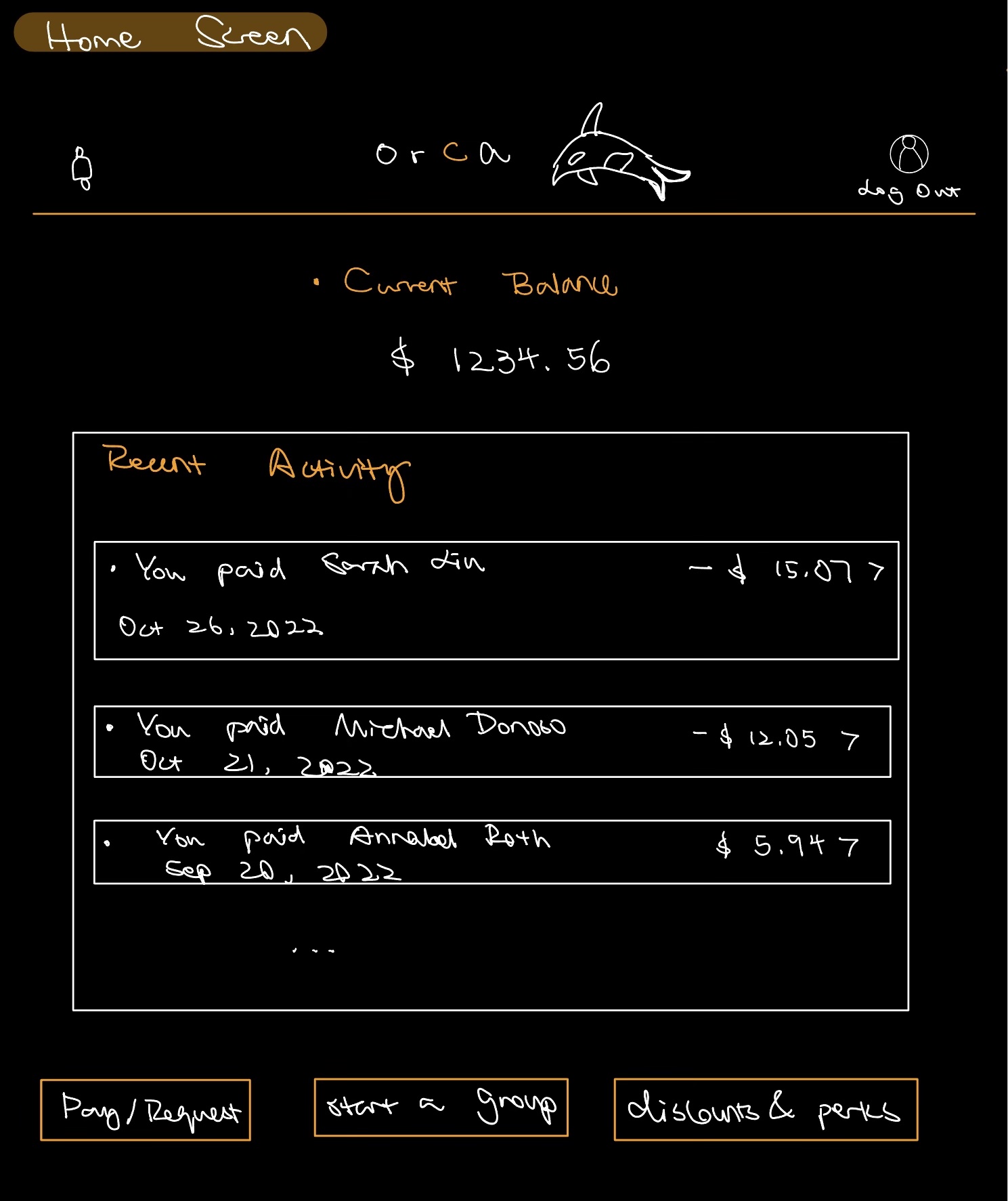
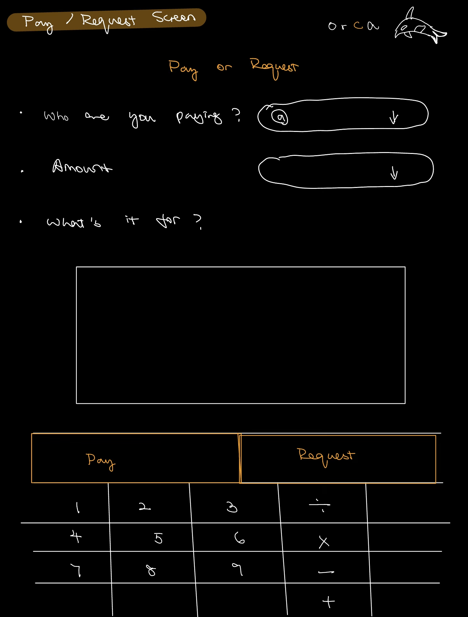
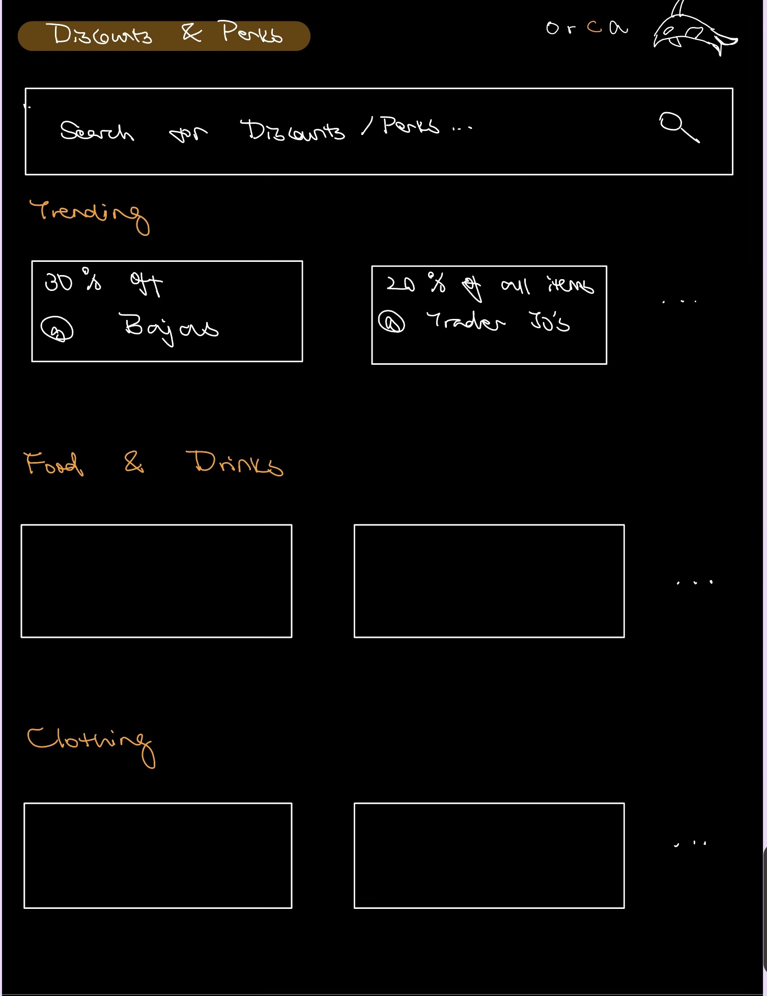
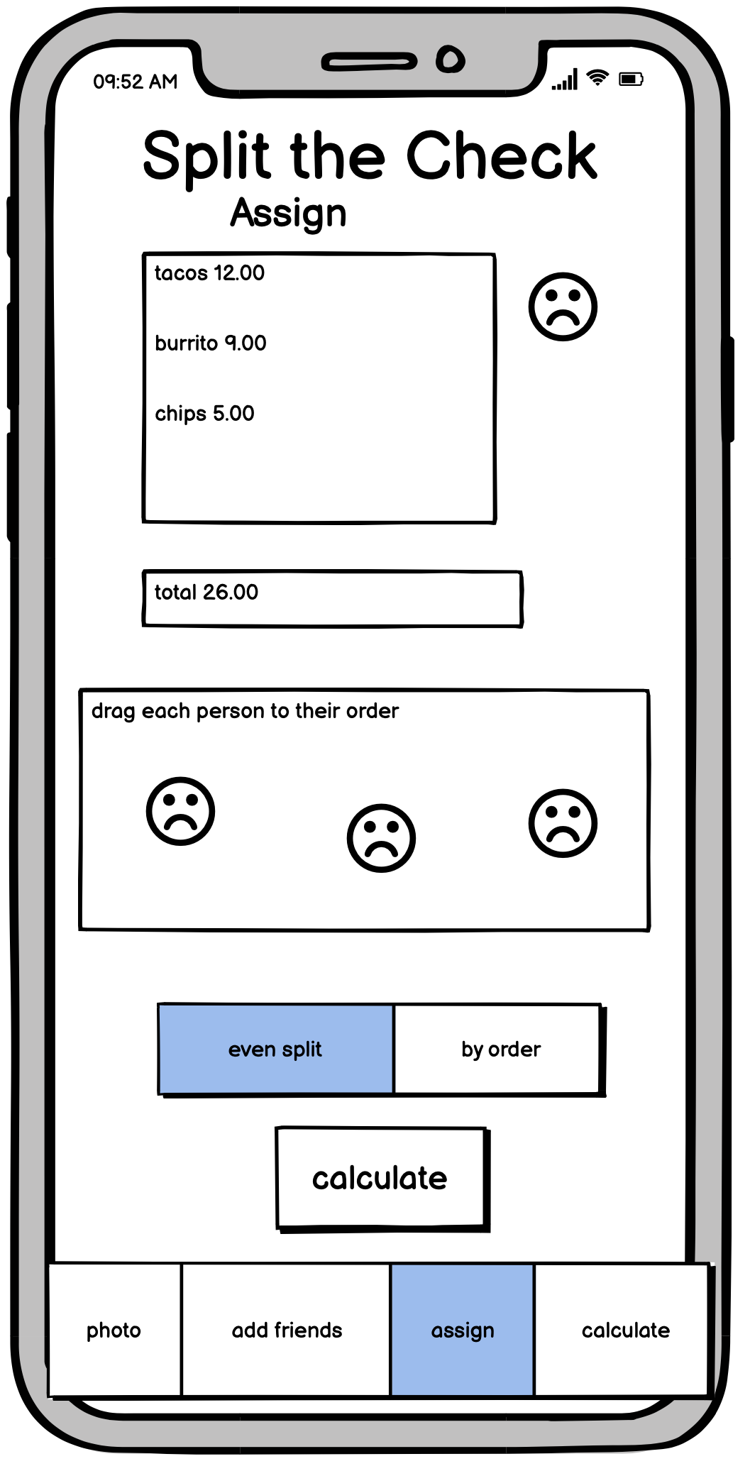
Final Wireframes
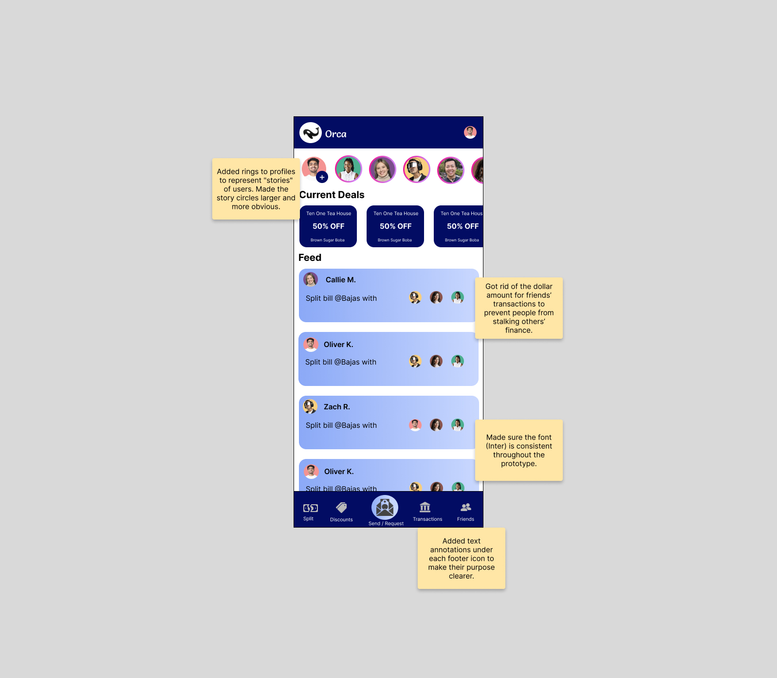
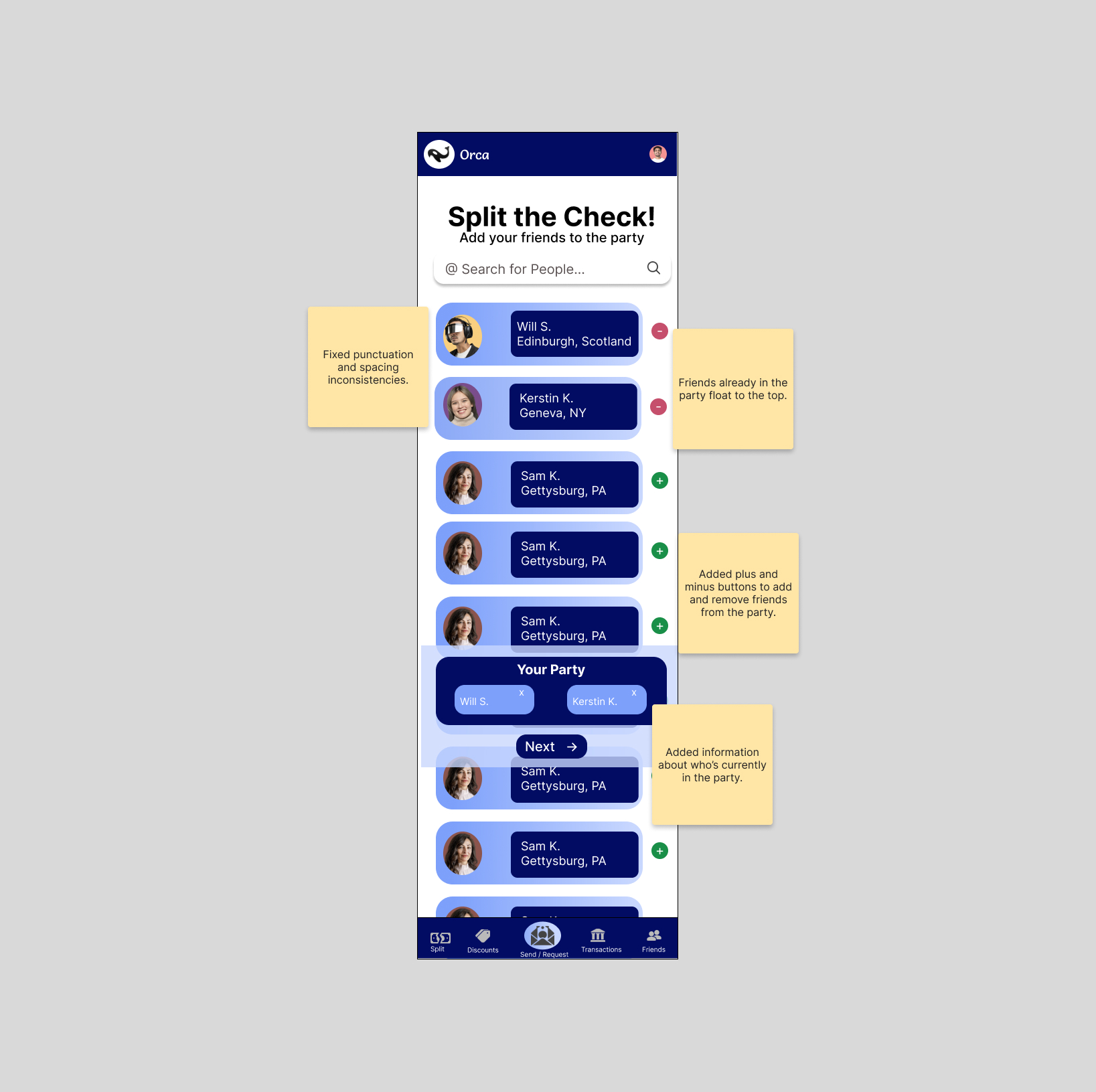
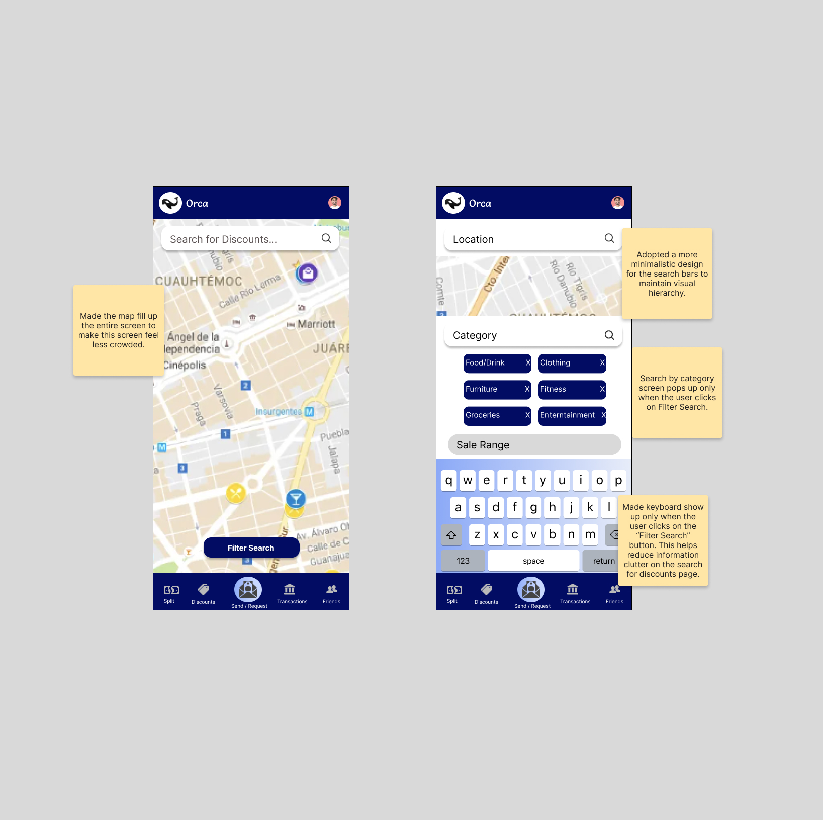
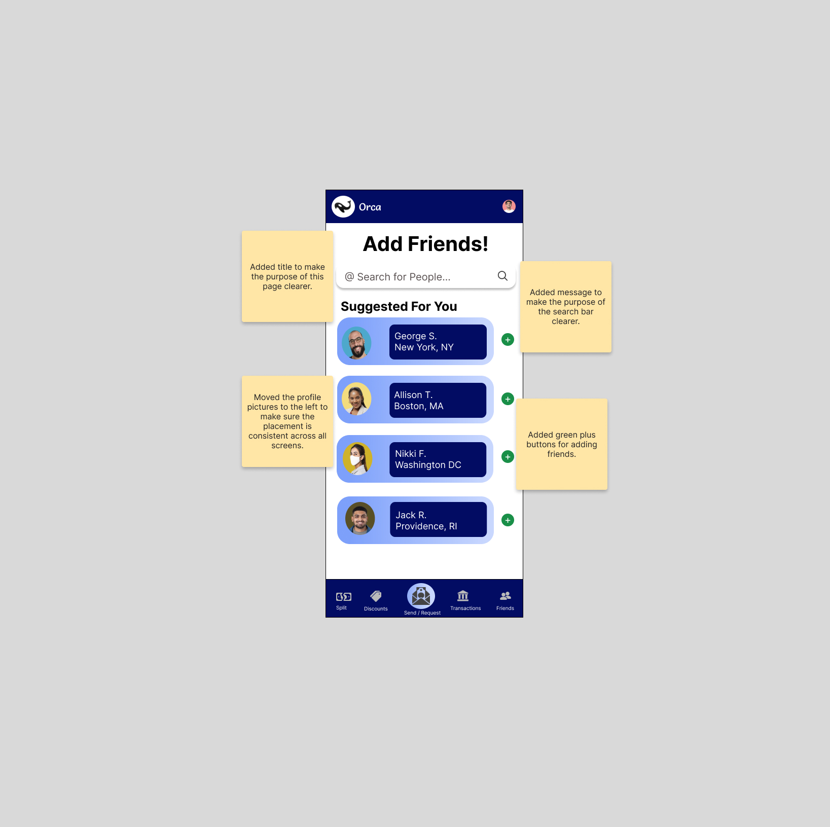
After our discussion, we compared our sketches and weighed the pros and cons of each approach. After we made our conclusions (highlighted in the sticky notes below), we created our final set of wireframes!
Below, click any screen to view an enlarged version and see our design decisions and philosophy!
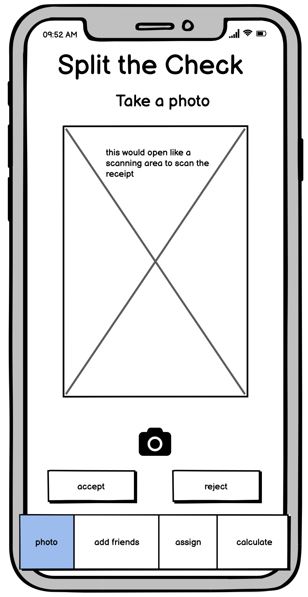
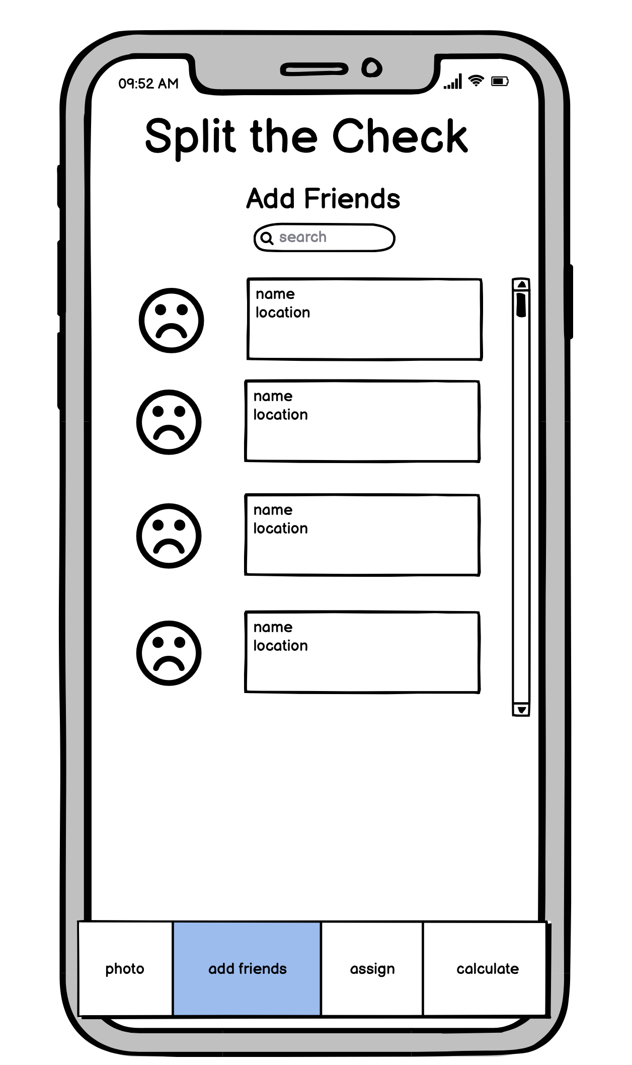
Hi-Fi Prototype
After making a LoFi prototype, we moved onto making our HiFi prototype in Figma. This prototype went through a few iterations (especially after incorporating the feedback from studio).
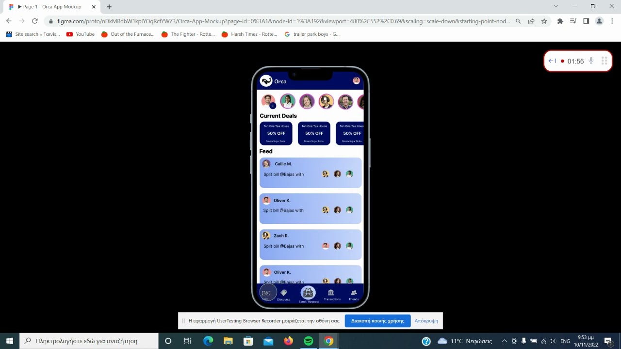
Every major screen is only, at most, two clicks away from the home page. This is to ensure that the user can easily navigate the app and find what they are looking for/perform the action they want to perform.
This keeps our User Journeys short and sweet, and the user can easily find what they are looking for.
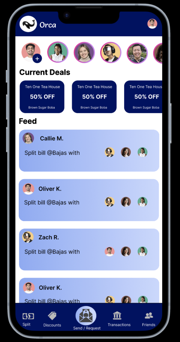
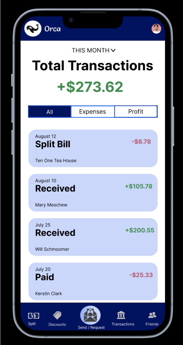
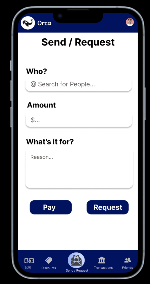
Screenshots
Here are some screenshots of the final version!
Figma Prototype
Below is the Embedded Figma Prototype! Be sure to click the "expand arrows" in the top right to start playing around with it!
Addressing Critiques of Hi-Fi Prototype
With our prototype in place, our team attended a Studio Session where other students critiqued our designs, and vice-versa.
Below are annotations on our Hi-Fi prototype including the prominent critiques we received, and how we ammended them in our final prototype! Click to get started!
Here are the quick notes we took during our Studio when receiving critiques. These are just for comphrensiveness sake and reference. Feel free to click the button to continue to the next section!
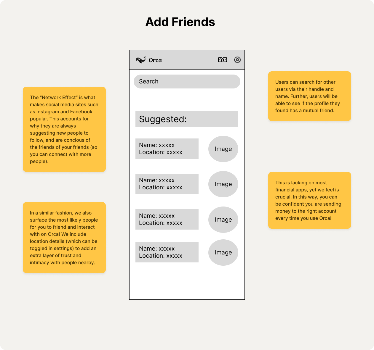
- add a plus button to include the users
- fix punctuation and spacing inconsistencies
- positive reaction to having access to this feature in the header
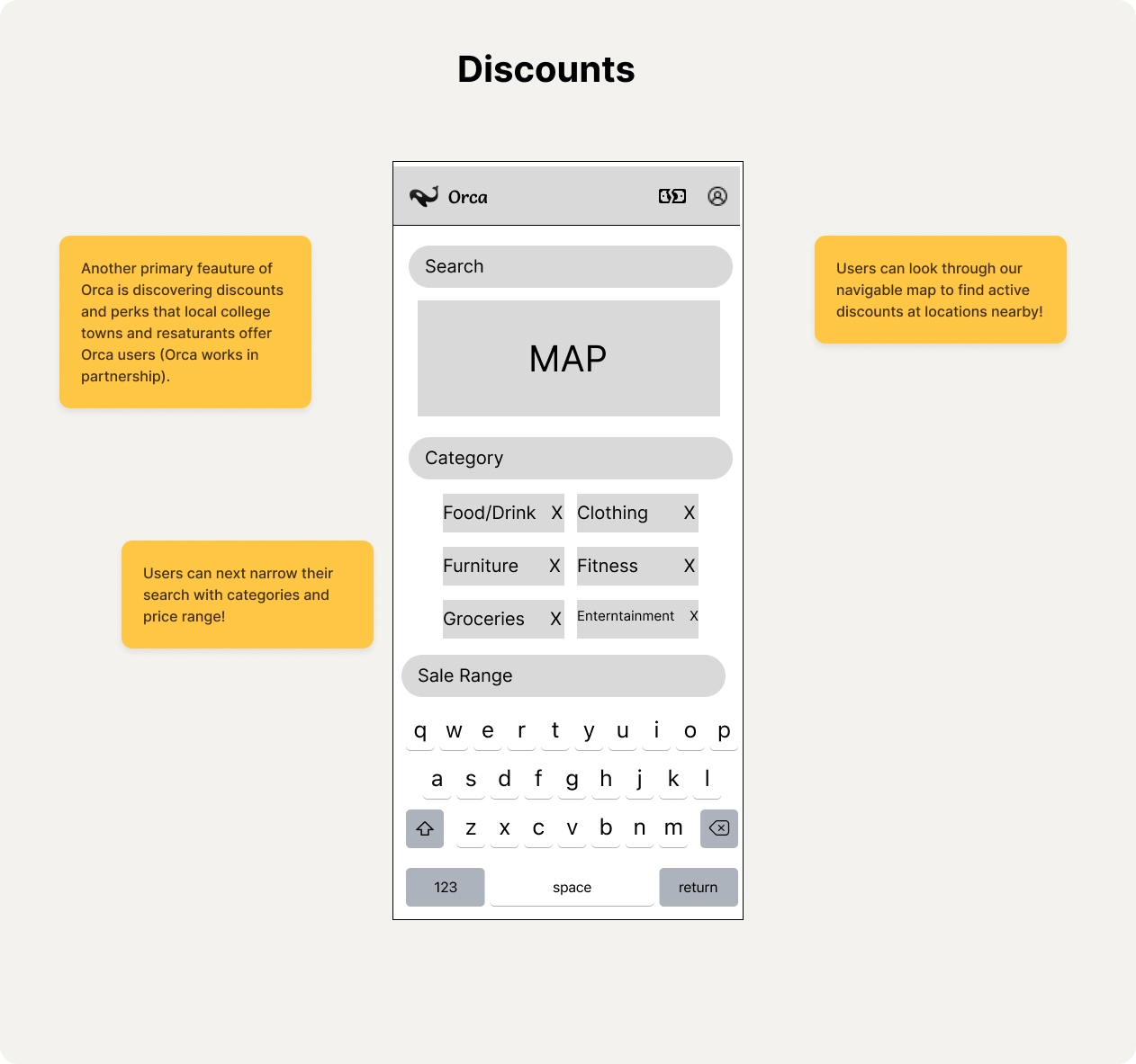
- fixing margins on second screen
- edit so that map takes up more of the screen
- screen is a bit too crowded
- add title to this page
- add button or other affordance to actually add friends
- it is currently a bit confusing what the purpose of this page is
- add rings for “stories” so look more realistic
- story component is a good addition in terms of the social media aspect of the app
- make story circles larger
- get rid of dollar amount in friends' transactions section
- on "Discounts" page, add link back to home page
- color choice is very good
- fix inconsistencies with keyboard appearance between screens
- make sure everything is cenetered and/or evenly spaced
User Testing
Task
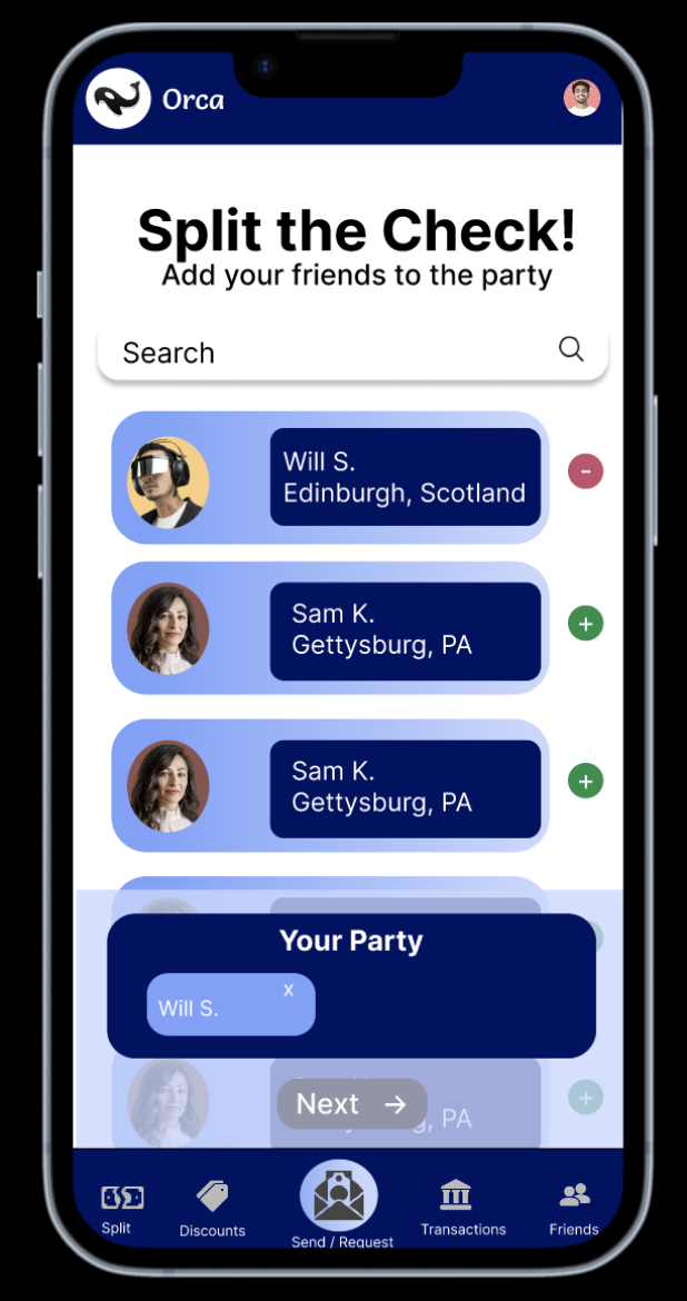
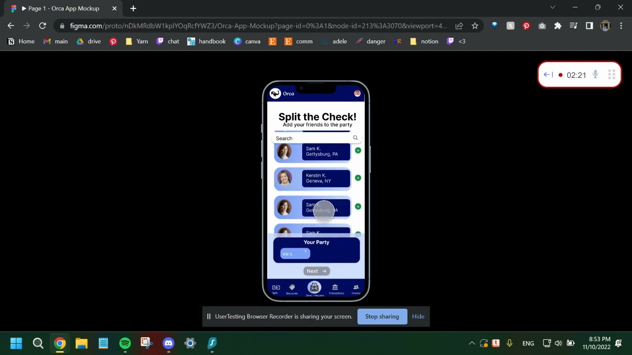
As a banking app built for Gen Z, one of Orca's most important features is splitting the bill with friends. This is a feature that existing apps such as Snackpass and Venmo do not have. With this in mind, we chose the following task for our user testing:
Split the bill with Will! Imagine you just had dinner with your friends and are trying to split the bill with them. You will use Orca, a banking app that allows you to send money and split bills with groups! You will follow instructions to complete your party and finish the check split!
Please try to think aloud as you complete this task. We would love to hear your thought process!
Note: This is NOT an actual website. It is an interactive mockup made on Figma, a prototyping software. Because of this, sometimes the buttons take a couple of clicks to work, and only some components are interactive. If you click on something that is not interactive, Figma will highlight the clickable areas in blue.
Instructions
Before you split the bill, you want to check how much you have already spent this month. Check your transactions for this month.
You are within budget this month! Go to the Split the Check page screen to start.
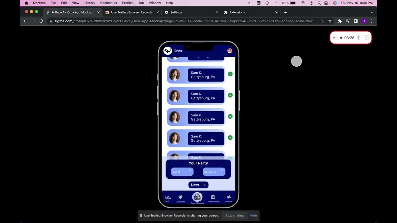
Look through your friends and add Kerstin K. to your party. Then go to the next page.
Assign Will S. to tacos. Then go to the next page.
Calculate the split and reach the confirmation page!
Result
Overall, the users completed the tasks successfully and found them straightforward. They liked the concept of splitting bills with friends and would consider using the app in real life. They particularly liked the Transactions page because it outlines their income and spendings for the month clearly.
Video Recordings
Below are the videos of 3 users that completed this task from UserTesting.com. Click on any of the videos to view!
Errors and Confusions
When to move between pages?
One user was confused about when to move from one page to the next.
Solution:
We could address this issue by adding more informative messages to better outline the flow of the app.
How to assign friends to items?
When assigning friends to items for splitting the check, the users made the mistake of clicking on the item instead of the user icons, even though there is a message at the top that says “Select friends from your party”. This is likely because the items are at the top of the page, which draw the users’ attention first.
Solution:
We could move the “Your Party” section to the top of the page and put the items toward the bottom. This way, the users would be more likely to select the friends and assign them to items.
How did Will get assigned to tacos?
The users were confused why when they clicked on Will S., he is automatically assigned to tacos. This is expected as a limitation of our prototype, because we couldn’t implement real drag and drop in Figma.
Solution:
If we were to implement Orca as an actual app instead of a prototype, we would be able to address this issue by adding drag and drop functionality.
I wonder how this feature would look?
The users were curious about the features of the app that are not demonstrated on our prototype, such as how we were able to display the prices of items for a check.
Solution:
This is expected, since we’re not able to include every page in our prototype.
Post-Test Questions and Response
What frustrated you the most about this app?
- Nothing was really frustrating, everything is pretty straightforward. Although the ratio of images to text is slightly off.
If you had a magic wand, how would you improve this app?
- I would make it more fun to use by adding colors and rewards.
- I would make how to assign certain items from the receipt to people clearer.
What did you like about this app?
- I liked how clear and simple the app was, and that it displayed my transactions as red or green depending on withdrawal or deposit.
- I like how there are two ways to split the bill, by item and evenly.
- I like how easy the app is to use!
How likely are you to recommend this app to a friend or colleague, 0=Not at all likely, and 10=Very likely?
- All 3 users responded 7 to this question
Conclusion
In the end, our team tracked down Orca's official email (and connected with them on LinkedIn 😊) and sent an email with our work. As of this writing, we are currently awaiting their response!
In the end, we learned the true value of continual iteration in regard to product design. As our team has a software engineering background, we are used to jumping straight into things and getting our hands dirty right away. However, it is critical to outline user journeys, personas, and requirements before jumping right into things in order to avoid repeated or producing work that gets scrapped down the line. It is the balance between development, defining requirements, and iterating that results in truly great products that make a positive difference for the world.